- Advice
5 tips for writing an un-sucky bio and About page
Are you a freelancer looking to entice new clients? Don’t underestimate the value of conveying your personality to market your business. Creating an About page on your website will help potential clients get to know you and feel more confident about your capabilities, even before you’ve chatted.
At its essence, an About page -- and no, it doesn’t need to be called that -- is where you should keep a bio about yourself. A successful bio should accomplish the following three things:
- Summarize your skills and expertise
- Provide your contact information
- Tell a little bit about yourself
A great bio can get a lot of mileage. In addition to using it on your business website, you can also tailor it for your LinkedIn, your blog or portfolio, your resume, and even requests from other organizations.
Here are 5 tips for making your About page and bio as awesome as possible.
Include a quick summary of yourself.
Since the About section might be the first page somebody goes to on your site, be sure to quickly paraphrase what you do even if you plan to include more information.
Designer Jessica Hische does a great job of starting with a short summary of herself before going into further detail.

Talk yourself up.
Your bio is not the place to be humble, so make yourself sound as awesome as possible and include your most notable accomplishments.

If writing this way feels cheesy, remember that potential clients have an agenda when they read about you. Instead of thinking, “Geez, why is this person so full of themselves?”, they’re examining your credentials and thinking, “What can this person do for me?” and “Can I trust this person to do the job that I want?”
Have you won an award, contributed to an open source project, been published somewhere significant, or just generally done something awesome? Say so. You will probably also want to include a partial client list.
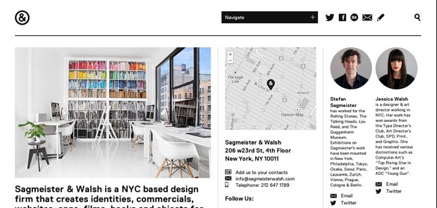
Designers Stefan Sagmeister and Jessica Walsh have very condensed personal bios on their firm’s website, but you’ll notice that they chose to call out specific career highlights, such as winning distinctions or working for the Talking Heads.
Show some of your personality.
A good About page will also make you sound like a real person. Don’t just put a list of qualifications – let your readers get to know you and find out what makes you tick. Some people choose to include a mission statement, while others talk about what they like to do when they’re not at work.
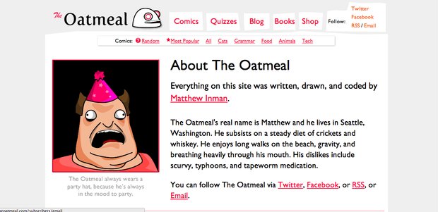
Matthew Inman has a very offbeat bio that perfectly complements his specialty – making web comics. But even though this bio is not serious, it still includes what Matthew’s real skills are (writing, drawing, coding) and how to get in contact with him.
Tailor your page to your audience.
Not a words person? Some people have had great success with creating visual or interactive websites that showcase their talents instead. As long as your page makes sense for your audience (and conveys why you’re hireable), it really doesn’t matter what format you choose.
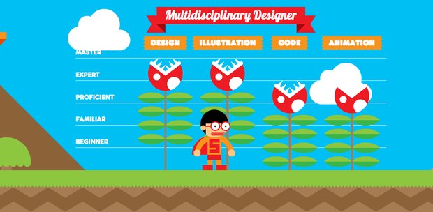
Robby Leonardi leveled up his career after creating an interactive resume inspired by Super Mario Bros:
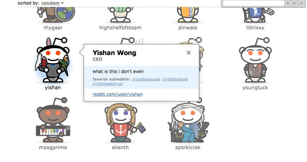
Another example can be seen on the popular website Reddit, which made an About page for staff. The page includes an avatar of each employee, their username and favorite subreddits, and whatever description they wanted.
Keep everything organized.
If you prefer to keep things short, by all means go ahead.
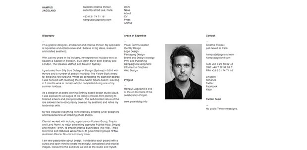
How long or short your About page doesn’t matter as much as making sure everything is easy to read. Designer Hampus Jageland does a great job of breaking out different pieces of information while still retaining his trademark style.
Freelancers, what tips do you have for writing an About page?
