- Advice
A freelancer's guide to starting a website
So you’ve got a business. Now it’s time to give it a home.
A business’ website is the heart and nerve center of all of its activities. Obviously, it’s the place that hosts foundational information about your business -- what you do and what you sell -- and the centerpiece for all of your marketing efforts. But it’s also the heart of your business in that it should speak about who you are and why you are.
Why have a website?
For freelancers, a website is both an extended portfolio/resume and a lead conversion tool.
The end goal of your business website is money in your pocket. Your website attracts new clients (through Google search, social media, etc.) and convinces existing leads (referrals, people you met at a networking event) to contact you.
The end goal is that email in your inbox that says, “Hey, I’d like to learn more about you.”
For some freelancers, a website can also evolve into a place where they sell physical products, have a blog, and host teaching materials or other side revenue streams.
What should your website do?
As I explained here, a freelancer’s website performs 5 main functions. They should be the skeleton of every website, no matter your field:
1. It should convey exactly what you do (clearly).
Some people may disagree with me, but I don’t think that your website should be the place to be creative about your job title. I’m immediately confused and turned off by “Creative Futurist” or “Game Changer,” but that’s up to you.
On the most successful websites, you understand exactly what the business does within a few seconds. For most freelancers, this means:
- You should include your name and a possibly 1-3 word description of yourself in the header of your website.
- You then use the main page to further illustrate (either visually or in words) what specific services you provide.
- You should also use the header of each page in your navigation to separate out different services, like so (from Katie Lane's great website):

2. It should provide your contact information.
This is a no-brainer. This is where you’re funnelling all your prospects, so they need a way to contact you to get more information. This is not the time to be shy about sharing your contact info. This is why you should create a separate email address for your business if you’re nervous. I recommend that you:
- Putt your email address in the footer of each page
- Put your email address on the homepage
- Put your email address on an about or contact page
- Alternatively, if you really want to hide your email address, use a contact form. This is available in almost all website template services or could be designed easily by your developer.
Most solopreneurs do not provide their cell phone number on their website.
3. It should display your portfolio, resume, or client testimonials.
Your website should communicate your expertise and build a foundation of trust -- before the client is even a client.
We talk about how to pull together a well-rounded portfolio that includes not just examples, but case studies, here. In many ways, your portfolio is the heart of your website. This is why many freelancers, especially visual artists, choose to make their portfolio the homepage of their website, so that visitors are immediately asked to browse through items.
I’m usually not a fan of putting a full resume (in PDF) on a website. I feel like resumes are generally going the way of the dinosaurs, and you can present yourself in a more compelling way with client lists, your portfolio, your LinkedIn page, testimonials, etc. Your website as a whole is a more complete version of your resume.
If a portfolio is not customary in your field, your work is non-material (like consulting), or your work is confidential, do what you can with your client list and testimonials. This involves actively asking for testimonials from past clients -- and if you’re a new freelancer, even past bosses. This is not ideal, but it is at least an honest account of your work habits and attitude.
4. It should portray your personality and work ethic.
You want to attract the right kind of clients.
High-quality clients are attracted by high-quality freelancers by conveying trust, relatability, and professionalism in the design and execution their websites. We’re going to go into how to do this in detail in the “Design of your website” section below.
5. It should be the hub of your all your online activity.
Your website should contain links to your social networks, your blog, etc. (Social networks = social proof that you are well-respected in your field.)
Freelancers usually choose to put this in the footer or top right header of their websites. Remember that clients will click through to these both to see the number of your followers (again, social proof) and to gauge your personality.
In a larger sense, your website should also be the thing that all your online networks lead back to. Your Twitter account should include your website URL in the bio. Your Facebook account should share blog posts from your website, etc.
Design of your website
This is a highly subjective area, but here’s what I recommend: keep it simple.
Ideally, you would be able to hire a freelance graphic designer to assist you in developing certain assets for your website, like a header or banner. But if you’re low on funds, find a simple template on one of the free or low-cost website services listed below, and keep it bare-bones.
In fact, it’s the fashion of websites currently to be extremely simple. No fancy sliding thingy on the homepage, no flash animation, no dark background textures, no script fonts. In 2014, clean websites look expensive. Better yet, simple elegance never goes out of style, so chances are that you won’t have to update the look and feel for a while.
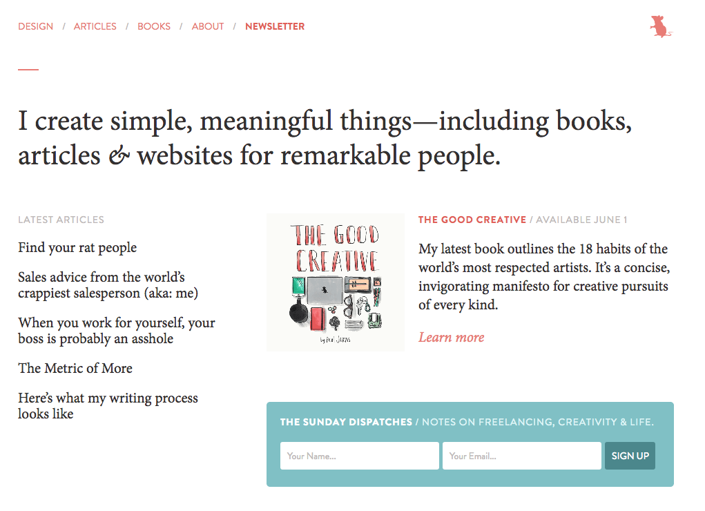
Paul Jarvis' simple but beautiful website:

To way over-simplify what's good about this website...
- Paul explains exactly what he does in 12 words -- and that’s the focus of the homepage
- His navigation is simple, and further illustrates what he does
- There’s lots of white space
- Simple color palette
- No flashing or moving things
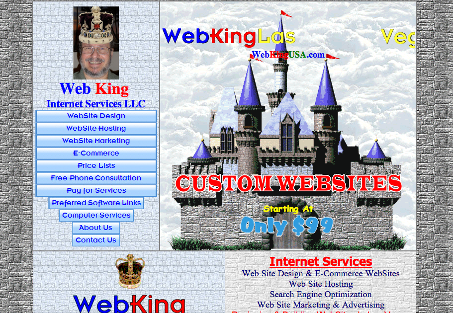
A website that looks dated:

You can't tell from the screenshot, but everything on this site moves.
Copy for your website
If you look at Paul’s website above, you can see the power of strong copy.
Good copy is simple, relatable, and conveys your personality or brand message. It’s worth its weight in gold.
My advice would be if possible, to hire a freelance copywriter who specializes in marketing copy for digital products. Someone who understands that less is more. While they may charge you $200 for 100 words of homepage copy, it will be worth it.
If you’re doing this alone, take a long time to write your copy! Don’t just put up anything.
- Read these great tips from Copyblogger before you begin.
- Think of yourself from your ideal clients’ point of view. What is the true service you’re providing? You’re doing Project Management, but to your client, you’re reducing stress, ensuring things get out the door on time, making their lives easier, etc. Now distill that into 15 words. Hard? Yes. That’s why copywriting is an art form.
- Surface one or two blog posts or portfolio items on your landing page. On a simple website, a single item of your work can do a lot of heavy lifting to convey your style and personality.
- Make the headings for each of your pages (home, about, etc.) very short and clear.
Not to harp on this, but I highly recommend that you check out all the articles on Copyblogger if you plan to write the copy for your own website. They’re a goldmine (and not just for bloggers, obviously).
Should you hire a web designer or developer?
If at all possible within your budget, yes.
Why? Because you can ignore everything I just told you. If you give a clear breakdown of your business, your brand, and your goals to your designer, a good designer will take it from there. Some designers even offer project management services to work with graphic designers and copywriters, so you don’t have to worry about a thing.
A web designer and developer are, for the most part, two different things. A developer is often “back end,” meaning they’re skilled at creating more complicated frameworks for websites (e-commerce, custom blog, any interface with a database), but probably are not skilled at designing the “front end” (what you and your customers will see). For the most part, freelancers create static websites and should look for a web designer.
The cost for web design work varies widely and also depends on the complexity of your website. Expect to pay more than $5,000 for a website. If you want to sell products on your website, it may cost more than $10,000.
Free or low-cost website options
If you’re on a low budget or just want to get started small and build up later, there are hundreds of low-cost options. You’re not going to get the unique, custom look of a website designed by another freelancer, but many of these sites offer attractive templates.
If you want free
Visit Wix, Weebly, Moonfruit, Wordpress, or Yola. Fill out their very simple templates. Add all the components above. They will provide you with a URL that is essentially still part of their website. For instance, you could get lindsayvt.wix.com, or yola.com/lindsayvt.
If you want low-cost
A domain name like lindsayvt.wix.com is not ideal. If you want your own domain name, you will probably pay close to $7-10 a month. Each of the services listed above offer to sell you a domain name and host your website. When you pay this monthly subscription, you are often also given access to a greater variety of (prettier) templates. Squarespace is also a popular option for many new freelancers; their low-cost option is $100/year.
If you’re a writer, you can look at free and low-cost portfolio websites here.
Remember: deduct the cost of your website on your taxes!
Keep track of all the expenses associated with your business website and deduct them on the Form 1040 Schedule C. We’ve reviewed exactly where and how to take deductions in this post.
Looking for other freelance tips? Join Freelancers Union today to gain access to even more great content.
